

0
Minimum Read

To design a branded t-shirt, start with one message rather than a logo, build a deliberate visual hierarchy around it, match the artwork to the decoration method and the garment colour, and simplify until the design survives both distance and the wash. Those four decisions determine whether the shirt gets worn far more than the price of the blank does.
A strong idea on a mid-range tee outperforms a weak idea on a premium one. That is the uncomfortable part for most marketing teams, because the product decision is the one that gets the attention and the budget conversation, while the design brief gets written in ten minutes on a Friday afternoon.
This guide covers the design side only. If you are still deciding which blank to order, the fabric weight, fit, and sourcing questions are covered separately in the ultimate guide to corporate t-shirts. Everything below assumes the blank is settled and the artwork is the open question.
Start with the job the shirt has to do
Every branded t-shirt has one job, and the design brief should name it before anyone opens a design file. The job determines almost every decision that follows, including how loud the branding can be.
Four jobs cover most corporate t-shirt programmes, and each pulls the design in a different direction:
Public giveaway, aimed at people who do not know the brand yet. The design has to earn a second look from a stranger. A clever line or a strong graphic does that. A logo alone does not.
Internal team wear, aimed at people who already know the brand. Here the design reinforces belonging. A shared reference, a milestone, or a value stated plainly will be worn more than a logo lockup.
Client or partner gifting, aimed at people who are being thanked. The bar is retail. The design has to work as a piece of clothing that happens to carry a brand, not the reverse.
Event and campaign wear, aimed at a specific moment. The design can be louder and more specific because its job is to be photographed and to date the moment on purpose.
The most common failure in corporate t-shirt design is one artwork applied to all four jobs. It ends up optimised for none of them. If the budget only allows one design, pick the job that matters most and design for that audience alone.
Write the message before you draw anything
A branded t-shirt is read the way a billboard is read from a moving car. Two or three seconds, in motion, at an angle, often partly obscured. Images register instantly. Text takes slightly longer. Anything that needs a third read is lost.
That constraint has one practical consequence: one message per shirt. Not one message and a tagline. Not a logo, a slogan, and a campaign hashtag. One idea, expressed once.
Two messages on one shirt compete for the same two seconds and both lose. If the brief contains two ideas that both feel essential, that is a sign there should be two shirts, or that the second idea belongs on the nape label where it will be found later rather than read at distance.
For brands that are not yet household names, a few words explaining what the company does is often stronger than anything clever. It answers the question the viewer is already asking, and it gives the wearer something to respond to when someone asks.
Choose the print position deliberately
Placement is a design decision, not a production default. Each position on a t-shirt carries a different tone and a different amount of visibility, and picking one on autopilot wastes the best variable available.
Left chest, roughly 8 to 10 cm wide. Reads as understated and professional. The highest wear rate of any placement because it looks least like promotional Merch. Best for logos and small marks, not for messages.
Full front, roughly 28 to 30 cm wide. The loudest option and the right one when the message is the point. Needs the most design discipline because there is nowhere to hide a weak idea.
Full back. Reads at greater distance than the front and works well at events where people are seen from behind in queues and crowds. Pairs naturally with a small left chest mark on the front.
Sleeve, roughly 7 to 9 cm. Subtle, fashion-adjacent, and easy to overuse. Works when the front is deliberately blank.
Nape or inner neck label. Invisible at distance, which is the point. This is where a founding date, a manifesto line, or a production origin belongs.
Hem or side seam. The quietest placement available and a strong choice for gifting pieces where any visible logo would reduce wear.
A useful rule: the less the audience already likes the brand, the smaller and quieter the branding should be. Loud branding is a privilege that gets earned, not a default.
Size the artwork to the garment, not to the screen
Artwork approved at 100 per cent on a monitor is being judged at a size and viewing distance that has nothing to do with how it will be seen. This is where most design briefs quietly go wrong.
Two checks solve most of it. First, print the artwork at its actual physical dimensions on paper, hold it against a shirt, and stand back three metres. Second, ask what happens across the size run. A full front print sized for a size L will look cramped on an XS and undersized on an XXL. Most suppliers can scale artwork across size bands, but only if the brief asks for it.
Also account for the seams. A design that crosses a side seam, a shoulder seam, or a pocket will not print cleanly, and on some garments it cannot be printed at all. Keep artwork inside the flat print area unless the whole point of the design is that it wraps.
Treat typography as a design decision
Font choice communicates personality before a single word is read. A bold sans-serif signals confidence and modernity. A serif suggests heritage and credibility. Hand lettering creates warmth and reads as person to person rather than corporate broadcast. Italics carry motion.
The default move is to use whatever font sits in the brand style guide and stop there. That style guide was almost certainly written for screens and print, where type is read at a fixed distance on a flat surface. Fabric is none of those things. It folds, stretches, and moves, and it absorbs ink at the edges of every letterform.
Three type rules hold on fabric almost without exception. Bold weights survive better than light ones. Fewer typefaces beat more. And anything below about 6 mm cap height starts to lose its counters, meaning the enclosed spaces inside letters like a, e, and o fill in and the word turns into a smudge.
Tight letter spacing is the other frequent casualty. Ink spreads slightly on fabric, so type that looks correctly spaced on screen can close up on the garment. Open the tracking a touch more than feels right.
Build the visual hierarchy on purpose
Individual elements are raw material. Composition is what turns them into something that communicates. Visual flow is the path you want the eye to travel, and on a t-shirt that journey happens in roughly half a second.
A design that works has three beats. The boldest element catches the eye. A supporting element supplies context. The brand mark or closing line resolves it. The viewer receives a complete message without consciously reading anything.
This does not happen by placing elements where they fit. It is engineered with size, weight, contrast, and position all pushing the same direction. The practical way to brief it is to list the design elements in priority order and hand that list over. Element one is dominant. Element two supports. Element three closes. A designer can then make those priorities feel intentional rather than mechanical.
If everything on the shirt is the same size and weight, there is no hierarchy, and the eye has nowhere to land. That is the most common reason a technically competent design feels flat.
Design for the decoration method, not against it
The decoration method is a design constraint, and picking it after the artwork is finished is backwards. Each method rewards a different kind of design and punishes the rest.
Screen printing suits bold graphics and flat colour areas. Every additional colour is a separate screen, which raises cost and registration risk, so designs with two or three flat colours are the sweet spot. Gradients and photographic detail fight this method.
Direct to garment handles complex, multi-colour, and photographic artwork with no per-colour cost, which makes it the right pick for detailed illustration. It sits softer on the fabric and generally reads less punchy than screen print on dark garments.
Embroidery reads as premium before the logo is even legible, which is why it suits left chest, cuff, and cap placements. It cannot do fine detail, small type, or gradients. Any artwork going to embroidery needs simplifying first, not scaling down.
Sublimation produces vivid, permanent colour but only on polyester and only reliably on light garments. It is a specialist choice rather than a default.
The full comparison of methods, including which techniques work on which fabrics, is covered in the guide to types of printing on clothes. Read it before the artwork is finalised rather than after, because the method will change the design.
Design for the fabric and the garment colour
The garment is not a neutral background. It is the largest colour in the design, and treating it as a blank canvas rather than a design element throws away the easiest win available.
On dark garments, light inks need an underbase, a white layer printed first so the colour above it reads true. That adds a print step and slightly stiffens the hand feel. Designing with the garment colour instead, for example a single tonal ink one or two shades from the fabric, avoids the underbase entirely and tends to look more expensive.
Heather and marled fabrics are the trap. The flecked surface breaks up fine detail and shifts perceived colour, so artwork that looks crisp on a solid tee can look muddy on a heather one. Bold shapes survive; thin line work does not.
Fabric composition matters just as much as colour, because a blend that resists ink will hold a print differently from combed cotton. The guide to fabric types and best materials for merch covers what each composition does to a print.
Simplify until the design survives the wash
There is a test most teams skip. Blur the design file until it is out of focus, or simply squint at it. What still reads? What collapses into noise? Whatever survives the blur is what the design communicates. Everything else is decoration that costs money and adds failure points.
Intricate illustration, thin line details, small type, and complex gradients all degrade on fabric, and they degrade further after laundering. A design that looks sharp in a mockup can be unreadable on the physical garment within a few months of regular wear. That is a brand problem, not just a print problem, because a shirt that ages badly reflects on the name printed on it.
The designs that last, physically and in terms of recall, are the bold ones. Large type, strong shapes, high contrast, and generous negative space all translate reliably from screen to fabric and hold up across the life of the garment. As a working minimum, keep line weights above roughly 1 mm and avoid any element that depends on detail smaller than a grain of rice.
Design a small system rather than a single shirt
A branded t-shirt is rarely a one-off. It sits alongside next quarter’s event tee and last year’s onboarding shirt, and the collection is what people form an impression of, not any single garment.
Three decisions make a system rather than a pile. Fix a small colourway set, typically one dark, one light, and one brand colour if it translates to fabric. Fix a placement logic, so the left chest always means one thing and the full front always means another. And fix a type treatment that carries across designs even when the artwork changes.
Teams that produce Merch regularly, agencies especially, tend to benefit most from this discipline because the volume of small drops is high. There are worked examples in the promotional Ideas for marketing agencies guide.
Size distribution deserves a mention here too. A design system is undermined by a size run that leaves people out. Order a broader range than the market-average breakdown suggests, because the cost of a few unworn units is lower than the cost of someone not getting a shirt.
What to hand over before production starts
Most production delays and most disappointing results trace back to an incomplete handover rather than a bad design. A complete brief contains the following:
Vector artwork, ideally AI, EPS, or PDF. Raster files should be 300 dpi at final print size, not scaled up from a web asset.
Exact Pantone references for every colour, not screen values. RGB and hex do not survive the trip to fabric.
Physical dimensions for each placement, in millimetres, plus the position measured from a fixed point such as the high shoulder point.
The decoration method, agreed before the artwork was finalised.
Garment colour and any per-colourway artwork variants, since a design often needs an inverted version for dark garments.
A named approver and a date, so the sample loop does not stall.
Request a physical sample or a pre-production photo for any run above a few hundred units. A screen mockup approves the idea. Only a sample approves the result.
Common branded t-shirt design mistakes
Putting two messages on one shirt, so neither reads.
Approving artwork at screen size instead of physical print size.
Choosing the decoration method after the design is locked.
Using a light-weight brand font that disappears on fabric.
Ignoring the garment colour and paying for an underbase that was avoidable.
Printing fine detail on heather fabric.
Scaling one artwork across the full size run without adjusting.
Designing an internal culture shirt with the branding volume of a trade show giveaway.
12 T-Shirts and What Each One Does for Your Artwork
The blank is a surface with opinions. Fabric weight, texture, and construction all change how a design lands, so the list below is organised around what each tee does to artwork rather than around fit or occasion. For a selection view organised by style and use case instead, see the guide to custom t-shirts that boost your brand.
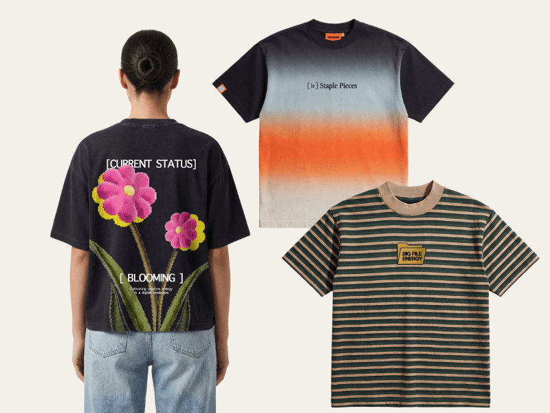
1. Bespoke T-Shirt
There is a meaningful difference between a tee that tolerates decoration and one built for it. The Bespoke T-Shirt is 100 per cent combed cotton with a smooth, consistent surface that takes screen printing, direct to garment, and embroidery without arguing with any of them. That makes it the safe pick when the artwork direction is still moving, because it does not force a decoration decision early. Use it as the hero piece when a design deserves room to be ambitious.
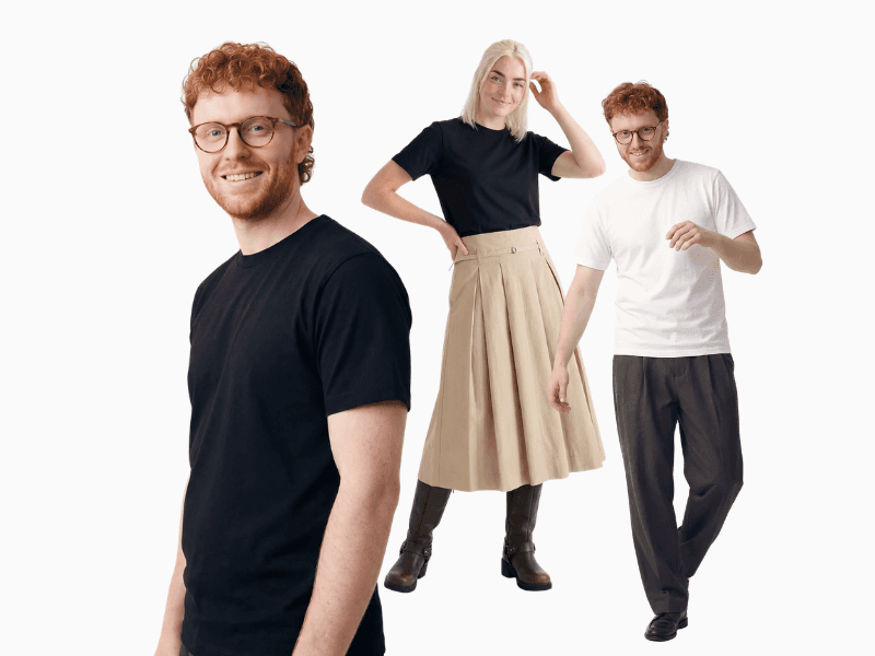
2. Premium T-Shirt
Fine detail vanishing on delivery is the single most common design disappointment, and it is usually a surface problem rather than a file problem. The Premium T-Shirt has a tighter, smoother face than a standard blank, which holds small type and thin line work far better. It is the one to reach for when the design depends on precision: a wordmark with tight counters, a line illustration, or small embroidered detail on the left chest.
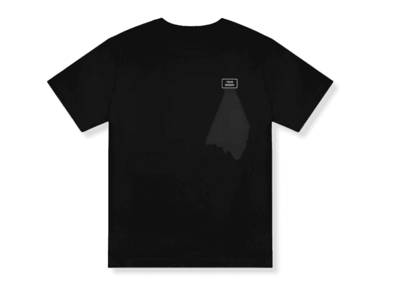
3. Classic T-Shirt
What if the garment colour did most of the design work? The Classic T-Shirt comes in an unusually wide colourway range, which means a tonal design, one ink a shade or two off the fabric, is achievable without compromise. That approach skips the underbase, keeps the hand feel soft, and reads as considered rather than promotional. It is the everyday canvas for programmes that want restraint.

4. Lightweight T-Shirt
Hold this one up and the light comes through it. That thinness is the point for warm climates and long event days, but it changes what the artwork can do: heavy ink coverage on a light fabric stiffens the panel and can be felt against the skin. The Lightweight T-Shirt rewards open, airy designs with plenty of negative space and punishes large solid blocks. Design for coverage, not just for looks.
5. Heavyweight Relaxed T-Shirt
Where the lightweight tee resists heavy coverage, this one invites it. The Heavyweight Relaxed T-Shirt has a dense, structured face that sits flatter under the squeegee, so large solid areas and high-opacity colour land cleanly and stay put. Bold typographic designs and full front graphics both look markedly better here than on a thinner blank. It is the right surface when the artwork is the loudest thing about the shirt.
6. Relaxed T-Shirt
A design that looks balanced on a flat mockup can sit off-centre on a body once the fabric drapes. The Relaxed T-Shirt has a looser cut in recycled cotton, and that extra fabric moves. Keep artwork centred and positioned mid-chest rather than high, because a print placed too near the collar will roll forward and read at an angle. Simple, symmetrical compositions survive the drape best.
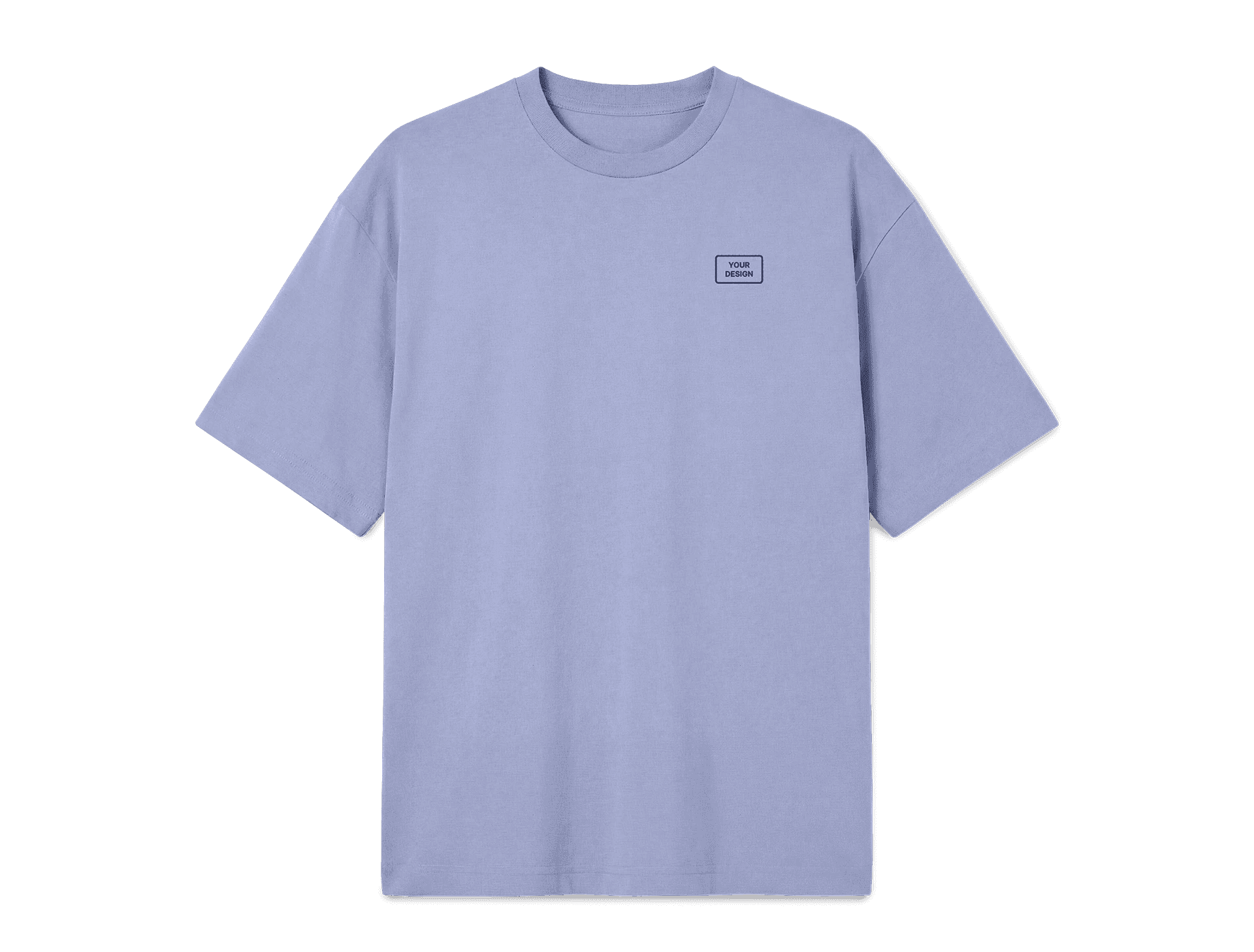
7. Lightweight Oversized T-Shirt
The dropped shoulder and boxy body add real estate that a standard cut does not have. On the Lightweight Oversized T-Shirt, a full front print can scale up several centimetres beyond the usual limit before it crowds the seams, which suits campaign artwork, layered typography, and designs with a lot going on. Scale the artwork up to match. An oversized tee with a standard-sized chest print looks like a mistake.
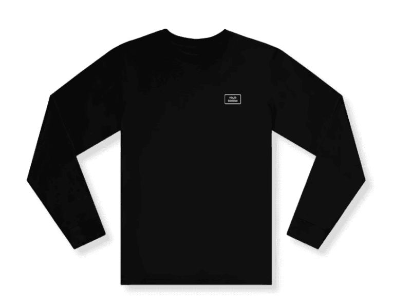
8. Premium Longsleeve T-Shirt
Compared with a short-sleeve blank, this one adds two long printable surfaces that most briefs forget exist. The Premium Longsleeve T-Shirt supports vertical sleeve prints running from shoulder to cuff, a small cuff hit, or a repeated element down one arm. Those placements read as designed rather than branded, which is exactly why they work on pieces intended for real wardrobe rotation.
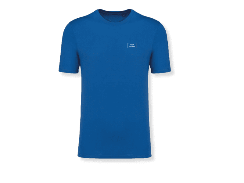
9. Made in Europe T-Shirt
Should the origin be part of the message or part of the product? With the Made in Europe T-Shirt it can be either, and the design decides. European production is a credible story for values-led brands, but it is a story that belongs in a woven label, a nape print, or an insert card rather than shouted across the chest. Keep the front for the idea and let the origin be discovered.
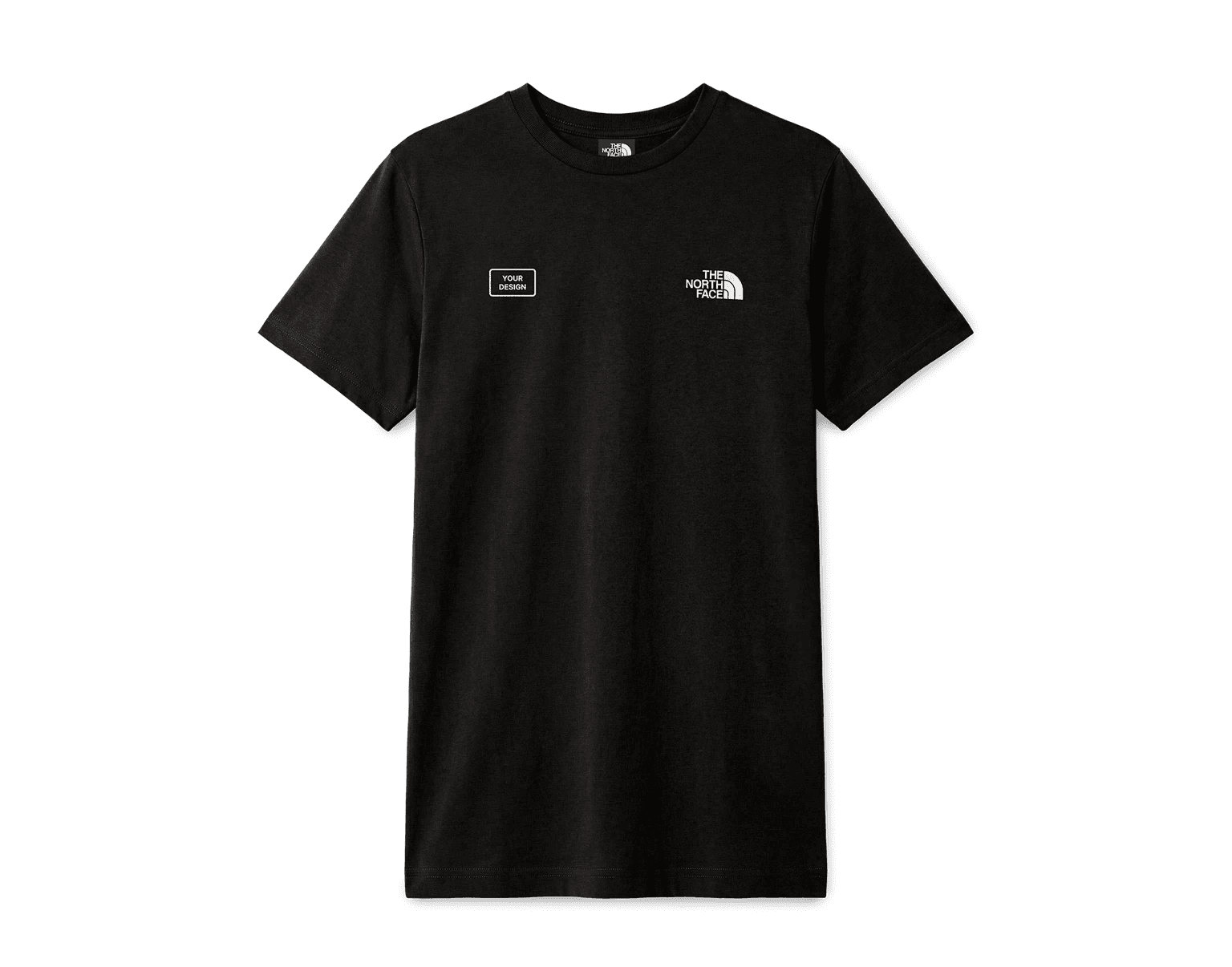
10. The North Face T-Shirt
Co-branding flips the usual design problem. The The North Face T-Shirt already carries a mark that people recognise, so the artwork has to play second and do it gracefully. A small, quiet left chest logo works. A full front campaign graphic fights the host brand and loses. The design constraint is the whole value proposition here, since the recognised label is what earns the wear.
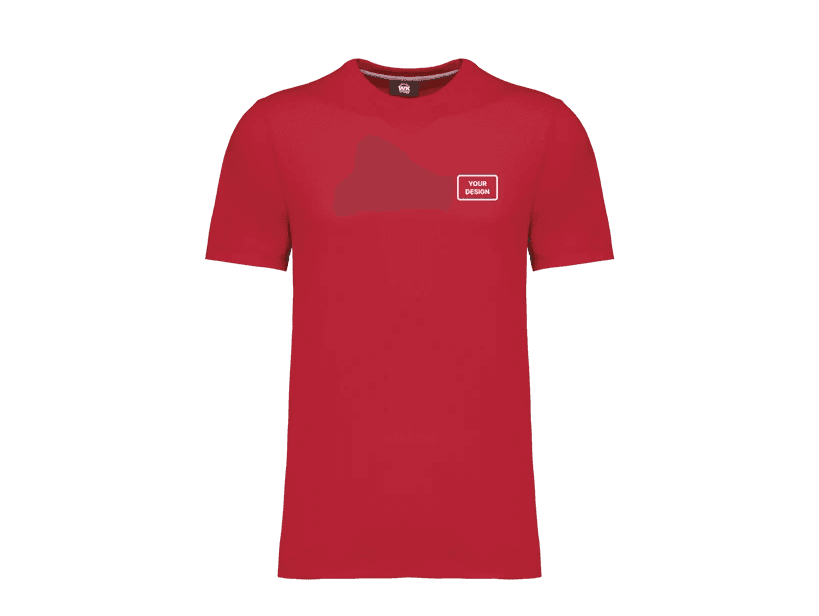
11. Workwear T-Shirt
A print that sits where a harness strap or a hi-vis vest rubs will not last a season. The Workwear T-Shirt is built with an antibacterial fabric and a straight fit for demanding environments, and the artwork should respect that context. Favour high-contrast marks that read across a site or a warehouse floor, keep placements clear of shoulder and chest wear zones, and choose durability of print over subtlety of finish.
12. Express T-Shirt
What can the design afford to be when the deadline is the constraint? The Express T-Shirt exists for the pop-up event and the launch that moved forward, and speed narrows the design space in useful ways. Fewer colours, one placement, print-ready vector on the first submission, and no sample loop. Simplicity is not a compromise on a rush job. It is the reason the job lands.
Getting the design right
For most marketing teams the bottleneck is not the brief. It is translating a brand direction into a layout that works at physical scale, on real fabric, in real light, on a garment that moves. That is a specialism most in-house design teams do not have, and it is the step where good ideas quietly become average shirts.
Monday Merch includes design services with every order. Send a brief and a concept comes back within 24 hours, produced by a team that has made branded apparel for thousands of companies and knows what holds up on fabric and what does not. Browse the custom t-shirt range to see the blanks, or talk it through first.
Contact the Monday Merch sales team to discuss your next branded t-shirt campaign.
Frequently Asked Questions
What makes a branded t-shirt design effective?
One clear message, a deliberate visual hierarchy, and bold simplicity. A design that tries to say several things at once says nothing clearly at the two-second glance a t-shirt gets. A single strong idea, well executed, beats a complex layout every time.
Where should the logo go on a branded t-shirt?
Left chest for anything intended to be worn regularly, because it reads as understated rather than promotional. Full front only when the message itself is the point. Nape, hem, and sleeve are for quiet branding on gifting pieces, where a visible logo would reduce how often the shirt is worn.
Should a branded t-shirt use screen printing or embroidery?
Screen printing for large graphics, flat colour, and full front or full back artwork. Embroidery for small logos on the chest, collar, or cuff, where the tactile finish signals quality before the mark is read. Embroidery cannot reproduce fine detail or gradients, so artwork destined for it needs simplifying rather than shrinking.
How big should a t-shirt print be?
Roughly 8 to 10 cm wide for a left chest mark and 28 to 30 cm wide for a full front on a mid-size garment. Print the artwork at those physical dimensions on paper and view it from three metres before approving. Scale the artwork across size bands rather than using one size for the whole run.
How many colourways should a branded t-shirt come in?
Two or three. One dark, one light, and one in a brand colour if it translates to fabric. More colourways complicate fulfilment, dilute the visual unity of the collection, and often need artwork variants for each, which multiplies the design work.
What file format do I need for a t-shirt design?
Vector artwork in AI, EPS, or PDF, with exact Pantone references for every colour. Raster files should be 300 dpi at final print size. Screen colour values do not survive the move to fabric, so specifying RGB or hex leaves the colour decision to someone else.
Read more about how to effectively use company swag or merch Packs for your business.


